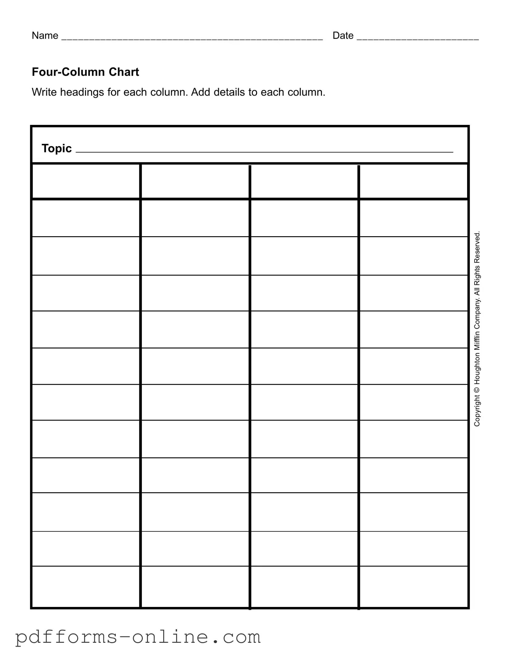
Blank Four Column Chart Template
The Four Column Chart form serves as a versatile tool for organizing information in a clear and structured manner. It typically consists of four distinct columns, each designated for specific headings that guide the user in categorizing relevant details. This format is particularly useful in various contexts, such as project planning, brainstorming sessions, or educational assignments. The first column often captures the main topic or theme, while the subsequent columns allow for the inclusion of supporting details, observations, or relevant examples. For instance, if one were to analyze a company like Mifflin, the first column could list key aspects of the business, while the other columns might delve into its strengths, weaknesses, opportunities, and threats. The simplicity of the Four Column Chart makes it accessible for individuals of all backgrounds, ensuring that complex information is broken down into manageable parts. By filling out this form, users can enhance their understanding of a subject and facilitate better decision-making.
Document Example
Name _______________________________________________ Date ______________________
Write headings for each column. Add details to each column.
Topic |
Mifflin Company.All Rights Reserved. |
Houghton |
Copyright © |
Frequently Asked Questions
-
What is the Four Column Chart form?
The Four Column Chart form is a simple tool used to organize information. It allows you to break down a topic into four distinct categories, making it easier to analyze and understand. This format is especially useful for brainstorming, project planning, or educational purposes.
-
How do I fill out the Four Column Chart?
To fill out the Four Column Chart, start by writing a heading for each of the four columns. Then, add details relevant to your topic under each heading. This could include facts, ideas, or any other information that fits into the categories you've chosen.
-
What types of topics can I use the Four Column Chart for?
The Four Column Chart can be used for a wide range of topics. Whether you’re working on a business project, studying for school, or organizing personal goals, this chart can help you visualize and categorize your thoughts effectively.
-
Is there a specific format I should follow for the headings?
There is no strict format for the headings in the Four Column Chart. You can choose headings that best suit your needs. However, it’s important that each heading clearly represents the content you plan to include in that column.
-
Can I use the Four Column Chart for group projects?
Yes, the Four Column Chart is an excellent tool for group projects. Team members can collaborate by contributing ideas to each column. This helps ensure everyone’s input is considered and can lead to a more comprehensive understanding of the topic.
-
What should I do if I run out of space in the columns?
If you run out of space in any of the columns, you can either use additional sheets of paper or create a digital version of the chart. Expanding your chart allows for more detailed information without losing the organized structure.
-
Are there any copyright issues with using the Four Column Chart?
The Four Column Chart itself is a generic organizational tool and does not have copyright restrictions. However, be mindful of any specific content you include that may be copyrighted. Always ensure that you have the right to use any material you add to your chart.
Misconceptions
The Four Column Chart form is a useful tool, but several misconceptions can lead to confusion. Here are nine common misunderstandings:
- It’s only for business use. Many believe the Four Column Chart is solely for corporate settings. In reality, it can be applied in educational, personal, and community contexts as well.
- All columns must contain equal information. Some think each column needs to have the same amount of details. However, the purpose of the chart is to organize information, which may vary in quantity across columns.
- The headings are fixed. There’s a misconception that the column headings are predetermined. Users can customize headings based on their specific needs and topics.
- It’s complicated to use. Many feel intimidated by the form, assuming it requires extensive training. In truth, it’s straightforward and user-friendly.
- It’s only for summarizing information. Some believe the chart is only for summaries. It can also be used for detailed analysis, comparisons, and brainstorming.
- It’s outdated. Some think that because it’s a traditional format, it’s no longer relevant. The Four Column Chart remains effective for organizing thoughts and data.
- You can’t modify the layout. There’s a belief that the format must remain unchanged. Users can adapt the layout to better suit their project requirements.
- It’s only for written content. Many assume the chart is limited to text. Visual elements like charts or images can also be incorporated to enhance understanding.
- It’s not useful for collaborative work. Some think the Four Column Chart is designed for individual use only. It can be an excellent tool for group projects, fostering collaboration and discussion.
Understanding these misconceptions can help users maximize the effectiveness of the Four Column Chart form.
Common mistakes
-
Failing to write a clear and specific topic in the first column. This can lead to confusion about what information to include.
-
Not labeling the columns with appropriate headings. Each column should have a title that reflects the content expected within.
-
Leaving the date section blank. This information is crucial for tracking and referencing the chart.
-
Writing too much or too little in the columns. Striking a balance is important for clarity and effectiveness.
-
Using vague or unclear language in the details. Specificity helps in understanding and analysis.
-
Forgetting to review the completed chart for accuracy. Errors can lead to misinterpretation of the information.
-
Neglecting to leave enough space for notes or additional information. This can be important for future reference.
-
Not following the correct formatting guidelines. Consistency in appearance aids in readability.
-
Overcomplicating the content with unnecessary jargon. Simple language is more effective for communication.
-
Failing to involve others in the process. Collaboration can enhance the quality of the information presented.
Additional PDF Templates
California Sdi - Providing clear and precise information on the DE 2501 can help prevent delays in benefit approval.
In navigating the complexities of legal agreements, it's essential to be well-versed in documents like the Hold Harmless Agreement, which plays a pivotal role in protecting parties from potential liabilities. For further insights and resources regarding this important legal tool, you can visit OnlineLawDocs.com, where comprehensive information is provided to aid in understanding the nuances of such agreements.
Cg 2010 Form 07/04 - Clarifying the definition of "your work" is vital for understanding coverage limits.
Document Data
| Fact Name | Description | Governing Law | Additional Notes |
|---|---|---|---|
| Purpose | The Four Column Chart is used to organize information systematically. | N/A | It helps in comparing different topics or categories. |
| Structure | The chart consists of four columns, each designated for specific types of information. | N/A | Headings should be clear and concise for better understanding. |
| Application | Commonly used in educational settings and business presentations. | N/A | Facilitates group discussions and decision-making processes. |
| Customization | Users can modify the headings and content to fit their needs. | N/A | Flexibility is key to its effectiveness. |
| Legality | There are no specific laws governing the use of Four Column Charts. | N/A | However, ensure compliance with copyright laws when using proprietary content. |
| Copyright | The content of the chart may be subject to copyright laws. | U.S. Copyright Law | Attribution is important when using materials from other sources. |
Similar forms
The Four Column Chart form bears similarities to the popular SWOT analysis template. Both documents are designed to help individuals or teams organize information systematically. In a SWOT analysis, users identify strengths, weaknesses, opportunities, and threats related to a particular project or business. Similarly, the Four Column Chart allows for the categorization of information into four distinct sections, facilitating a clear understanding of various aspects of a topic, such as the Mifflin Company in this case.
Another document that shares a resemblance with the Four Column Chart is the T-Chart. This simple yet effective tool allows users to compare two opposing ideas or concepts side by side. Like the Four Column Chart, a T-Chart provides a visual representation that aids in decision-making. Users can list pros and cons, or advantages and disadvantages, helping them to weigh options clearly and effectively.
The Venn diagram is also akin to the Four Column Chart in its visual approach to organizing information. While the Four Column Chart divides information into four columns, a Venn diagram uses overlapping circles to show relationships between different sets of data. Both tools help clarify complex ideas and highlight similarities and differences, making them useful for brainstorming sessions or collaborative discussions.
Mind maps serve a similar purpose as the Four Column Chart by visually organizing information. A mind map starts with a central idea and branches out into related topics, allowing for a free-flowing exploration of ideas. While the Four Column Chart is more structured with its four designated columns, both formats encourage creative thinking and help users see connections between different pieces of information.
Flowcharts are another document that shares common ground with the Four Column Chart. Flowcharts visually represent processes or workflows, breaking down steps in a clear and logical manner. Just as the Four Column Chart organizes information into distinct categories, flowcharts help users understand sequences and relationships in a process, making complex information easier to digest.
Checklists are also similar to the Four Column Chart in their functional approach to organizing tasks or items. A checklist provides a straightforward way to track completion and ensure that nothing is overlooked. While the Four Column Chart focuses on categorizing information, both documents serve as practical tools for organizing thoughts and ensuring thoroughness in various contexts.
Project management templates often resemble the Four Column Chart in their structured layout. These templates typically include sections for tasks, deadlines, responsible parties, and status updates. Like the Four Column Chart, project management templates help teams stay organized and focused, ensuring that all aspects of a project are accounted for and progressing as planned.
In relationships where future uncertainties loom, a prenuptial agreement form serves as a protective measure for individuals entering into marriage. This document clearly outlines the financial responsibilities and asset ownership, ensuring both partners understand their rights should the marriage dissolve or terminate due to unforeseen events. It's crucial to have these conversations ahead of time; therefore, All Arizona Forms provide the necessary tools to get started on creating a solid foundation for your marital future.
Finally, the business model canvas shares similarities with the Four Column Chart in its comprehensive approach to outlining key components of a business. The business model canvas allows users to visualize critical elements such as value propositions, customer segments, and revenue streams. Both documents encourage clarity and strategic thinking, helping users to map out essential information in an accessible format.